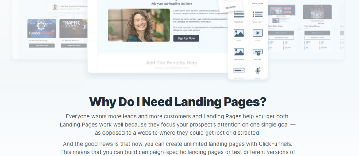
Creating captivating landing pages that are intended to turn visitors into leads, sales, or email newsletter sign-ups becomes easy using ClickFunnels – one of the best tools for the job.
An effective landing page can be worth the investment of money, time, and effort if your website has a clear purpose. Businesses using optimization software for their landing pages see an average conversion lift of 30%.
What is a Landing Page?
A landing page is a standalone web page specifically designed to prompt a particular action or conversion from visitors, often tied to marketing or advertising campaigns. It serves as the entry point for users, focusing on a single objective, such as encouraging sign-ups, purchases, or subscriptions. It typically contains targeted content, persuasive elements, and a clear call-to-action to drive visitors toward that intended goal.
Why ClickFunnels?
ClickFunnels is marketed as a tool that allows you to “quickly create beautiful sales funnels that convert your visitors into leads and then customers.” It is among the finest, with over 525,902 website users (Source).
Types of ClickFunnels
Exploring the diverse array of ClickFunnels pages opens a gateway to understanding their unique roles in guiding customer journeys. Each type of page within ClickFunnels plays a pivotal role in directing user interaction and fostering conversions through tailored content and strategic placement.
Type of ClickFunnels:
- Affiliate Funnel: With ClickFunnels, an affiliate funnel is a prearranged set of pages designed to lead prospective clients through the sales process while leveraging affiliate marketing techniques to increase revenue and affiliate commissions.
- Application Funnel: ClickFunnels Application Funnels simplify the procedure of gathering and assessing applications for a certain objective.
- Webinar Funnel: The purpose of a ClickFunnels webinar funnel is to draw attendees to an online workshop or presentation.
- Book Funnel: Using a customized flow, a ClickFunnels Book Funnel guides users through the promotion and sale of a book.
- Free+Shipping Book Tripwire: A Free+Shipping Book Tripwire Funnel serves as an entrance point for additional sales by giving away a book in exchange for clients paying shipping.
- Tripwire Funnel: A ClickFunnels Tripwire Funnel presents a low-cost offer to turn leads into paying clients.
- Website Funnel: With an emphasis on conversions, a ClickFunnels website funnel maximizes the user journey via a website.
- Squeeze Page Funnel: To create a subscriber list, a squeeze page funnel quickly gathers user information, typically with an alluring offer.
10 Best ClickFunnels Landing Page Examples for 2024
We’ve gathered 10 examples below to help you grasp the platform’s potential and get ideas for your next landing page design.
These examples were chosen and arranged according to a few criteria, including the platform capabilities they employ, the design they highlight, and the user experience they offer.
- AppSumo
AppSumo is a marketplace for software where companies may offer and sell their applications. They utilized a ClickFunnels-created landing page to promote their affiliate program. After selecting the affiliate application button, potential affiliates can provide their details.
Among its essential components are:
- Strong calls to action (CTAs)
- Writing Persuasive Copy
- Elements of Strategic Design
- ReGreen
With the help of eye-catching graphics and environmentally conscious features, ReGreen’s ClickFunnels landing page effectively communicates the game-changing potential of its sustainable services. It also does a great job of enticing visitors to take action with obvious calls-to-action and convenient contact forms. ReGreen is positioned as an authoritative and reliable option for individuals looking for energy, solutions that are ecologically responsible thanks to its diverse approach.
Key Elements
- Irresistible Lead Magnet
- Minimalist Design:
- Clear Value Proposition
It performs the following duties:
- Lead Generation
- Conversion optimization
- MyLocker
ClickFunnels is used by MyLocker, a firm that creates print-on-demand products for other businesses, to host their job board. Prospective employees can find all the essential information about the position—such as the age requirements, benefits, and salary—on the landing page.
The job seeker is taken to a different page on another website to finish the application after clicking “Apply Now.”
Its essential components are:
- Strong calls to action (CTAs)
- Writing Persuasive Copy
- Elements of Strategic Design
- Market Traders
Market Traders is a community for those interested in financial trading. They advertise their $247 main membership offering using the platform’s landing page builder.
The checkout page on this website is incorporated right into the landing page, saving potential customers from having to visit another page.
Features:
- User-Friendly Navigation
- Exclusive Content Access
- Subscription Management
- ALTENEW
To generate leads and market its e-book, ALTENEW has a landing page. In exchange for their name and email address, anyone who is interested in obtaining the ebook can do so for free.
Digital downloads can be hosted and delivered using ClickFunnels 2.0. In this case, the platform may automatically transmit the e-book to the customer’s email address.
Key Elements
- Minimalist Design:
- Clear Value Proposition
It performs the following duties:
- Lead Generation
- Conversion optimization
- Envision
A Call to Action (CTA), including an email field and a straightforward yes/no question, is prominently displayed on Envision’s landing page.
Since simplicity is essential in this case, you are presented with the questions one at a time, simply clicking the next box rather than having to navigate through a list. The user finds this to be more interesting and less scary.
All of this is positioned next to a huge image of a happy woman using a smartphone. The image conveys optimism and the promise of a joyful resolution to financial difficulties. An instant message box to speak with an employee directly is located at the bottom right of the page.
This provides a point of contact for building rapport with the client. It is centred at the bottom of the first page and consists of three steps that are visually represented by icons under each heading.
Taking what may otherwise be a complicated procedure and breaking it down into three simple steps offers the reader confidence and control while utilizing Envision as a financial service.
It all comes down to finding the ideal fit and understanding the needs of the client, which is what Envision’s LP excels at.
Important components:
- Landing Pages with an Affiliate Focus
- Paid Referral System:
- Marketing Assistance:
- The Event Planning Blueprint
A form for registering for the webinar event is available on this landing page. The Event Planning Blueprint landing page features several comments and endorsements from past clients. This can assist in dispelling any reservations website visitors might have about signing up.
Companies using ClickFunnels 2.0 may then programmatically send webinar invitations and follow up with potential clients by setting up an email sequence.
Features:
- User-Friendly Navigation
- Exclusive Content Access
- Subscription Management
- Shic Mastermind
A one-on-one training program called the Shic Mastermind helps companies increase sales. They use a video sales letter at the top of the page to entice visitors to register to sell their items.
ClickFunnels 2.0’s pricing and three subscription tiers are shown on their landing page. This is an excellent illustration of a business offering a premium program through ClickFunnels 2.0.
Among its Essential Components are:
- Engaging Video Sales Letters (VSL)
- Appealing Content
- Well-Timed Calls to Action
Features:
- Conversion of Leads
- Involvement of the Audience
- Children Learning Reading
A computerized program called Children Learning Reading teaches kids how to read. Customers who buy the product get access to audio files, flashcards, and 32 courses, among other digital downloads.
The landing page promotes the notion that a consumer can access the product immediately upon making a purchase.
By building behavior-based email flows on ClickFunnels 2.0, companies can automate the delivery of digital items.
Its essential Components are:
- Engaging Video Sales Letters (VSL)
- Appealing Content
- Well-Timed Calls to Action
10. MIG Soap
The message for this landing page is prominently displayed in a middle column with white borders on either side.
The question “Do you ever feel like you were meant for more?” is the next in a series of pointed inquiries meant to pique the reader’s interest and spur action.
All of the questions are designed to elicit affirmative responses.
By posing assertions that the reader cannot help but agree with, these kinds of questions entice the reader to pay attention to that inner voice we all possess that constantly exhorts us to be our best selves.
All of this is set against a colourful backdrop of crisp veggies and fruit.
The neat appearance produced by the thoughtful use of space reflects the clean lifestyle that is being promoted. A page detailing the benefits of completing this challenge follows, maintaining the same open, airy design as the preceding page. Next, we have product endorsements from satisfied consumers. Offering a challenge such as “The 14-day Challenge” is an excellent idea to keep your audience interested. It’s a win for you when they win.
Among its essential components are:
- Strong calls to action (CTAs)
- Writing Persuasive Copy
- Elements of Strategic Design
It performs the following duties:
- Lead Generation
- Conversion optimization
Conclusion
Keep in mind that ClickFunnels is a strategic partner in your digital journey, not merely a tool. As you implement the knowledge from these illustrations, picture how ClickFunnels can change the face of your company. The opportunities are endless; accept its features, try out various funnel tactics, and observe how your web visibility grows.
Below is a table of various landing page elements you should always have at the back of your mind:
| Elements | Considerations |
| Value | Communicate what you offer |
| Headline | Craft a short, attention-grabbing message. |
| Visuals | Use engaging images or videos. |
| Copywriting | Keep text clear, concise, and focused. |
| Call to action | Place a clear and compelling action prompt. |
| Mobile Optimization | Ensure a good experience on all devices. |
| SEO practices | Use relevant keywords and meta tags. |
| Message Focus | Keep the message centered around a clear goal.SEO Practices |
People also ask
- Landing Pages, Websites, and Sales Funnels: What’s the Difference?
Single web pages, or landing pages, are created with a specific goal in mind, such as lead generation. Websites are more extensive, multi-page web platforms. A sequence of actions leading website visitors to a transaction is known as a sales funnel.
- What are good conversion rates for landing pages?
Landing pages have an average conversion rate of 9.7% (Source).
- What is the average conversion rate for ClickFunnels?
Conversion rates on ClickFunnels are significantly higher, with some outliers approaching 40%+ (Source).


