Data analysis is one of the most important parts of running a business, company, organization, and a whole lot more.
Unfortunately, it also gained the reputation of being boring because it’s too technical that only people involved in it would understand it.
That’s not the case anymore. Today, data analysis is more about story-telling than it is about presentation.
That’s why you want to ensure that you have a data visualization tool that’s easy to use and comprehend to improve your business strategies further.
Here’s a star-studded list of some of the best data visualization tools.
Best Data Visualization Tools
| Data Visualization Tool | Free | Paid |
| 1. Tableau Public | ✓ | ✘ |
| 2. Toucan Toco | 15-Day Trial | ✓ |
| 3. Google Data Studio | ✓ | ✘ |
| 4. Microsoft Excel | 30-Day Trial | ✓ |
| 5. Google Charts | ✓ | ✘ |
| 6. Qlik Sense | 30-Day Trial | ✓ |
| 7. Datawrapper | ✓ | ✓ |
| 8. Whatagraph | 7-Day Trial | ✓ |
| 9. D3 | ✓ | ✘ |
| 10. Zoho Analytics | ✓ | ✓ |
| 11. RAWGraphs | ✓ | ✘ |
| 12. Sisense | 14-Day Trial | ✓ |
| 13. Infogram | ✓ | ✓ |
| 14. Highcharts | ✓ | ✓ |
| 15 Microsoft Power BI | ✓ | ✘ |
| 16. Dundas BI | 25-Day Trial | ✓ |
| 17. Fusion Charts | ✓ | ✓ |
| 18. Domo | 30-Day Trial | ✓ |
| 19. Flot | ✓ | ✘ |
| 20. Chartist.js | ✓ | ✘ |
| 21. dygraphs | ✓ | ✘ |
| 22. Plotly | ✓ | ✘ |
| 23. JupyteR | ✓ | ✘ |
| 24. IBM Watson | ✓ | ✘ |
| 25. QlikView | ✓ | ✓ |
1. Tableau Public
Tableau is one of the most beginner-friendly free data visualization tools out there.
The best part is that developers and non-developers alike will find that their charts, graphs, and maps are easy to use and understand.
However, one downside to this tool is that, since it’s free, the features are quite limited.
The free version will not allow you to save the graphs to a local storage device. Additionally, if you decide to publish your data visualizations, it becomes accessible to the public.
Ergo, it’s not the best choice if you’re presenting your company’s confidential data.
Advantages:
- Easy to use
- Mobile-friendly
- Growing community
- Premium visualization
- Seamless processing
Disadvantage:
- Data is accessible to the public once published
2. Toucan Toco
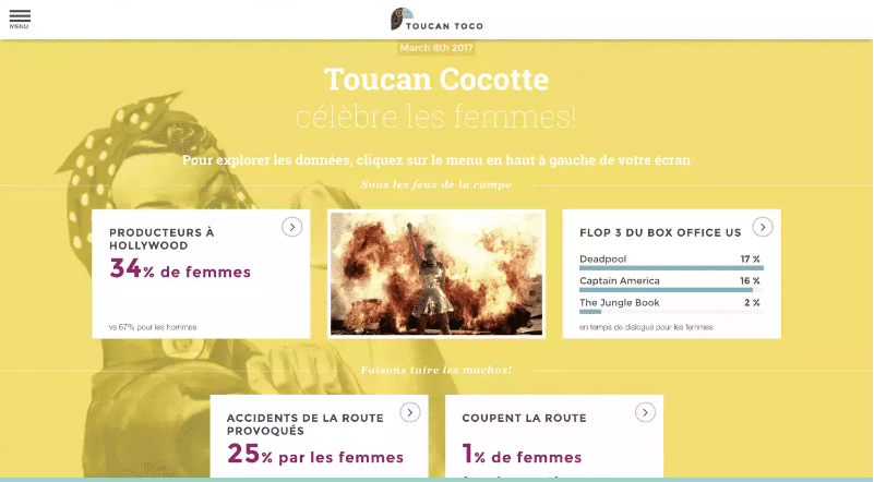
Toucan Toco is a paid tool for data visualization that specifically targets business users. You can access your files anytime and anywhere as long as you have internet since it’s cloud-based, which is perfect for remote jobs.
You can also use streamed or stored data to prepare your graph or chart.
Even if you’re not an expert with data visualization, Toucan Toco will make it easier for you.
You can also add context to your graphs and charts to improve your data storytelling.
Toucan Toco offers a free trial to new users. You just have to provide them with your complete name, email, and company name.
However, the trial only lasts for 15 days.
Advantages:
- Cloud-based
- Allows use of stored data
- User-friendly interface
- Can add contexts
Disadvantages:
- No free version
- Complex and multiple dataset charting might need advanced user knowledge
3. Google Data Studio
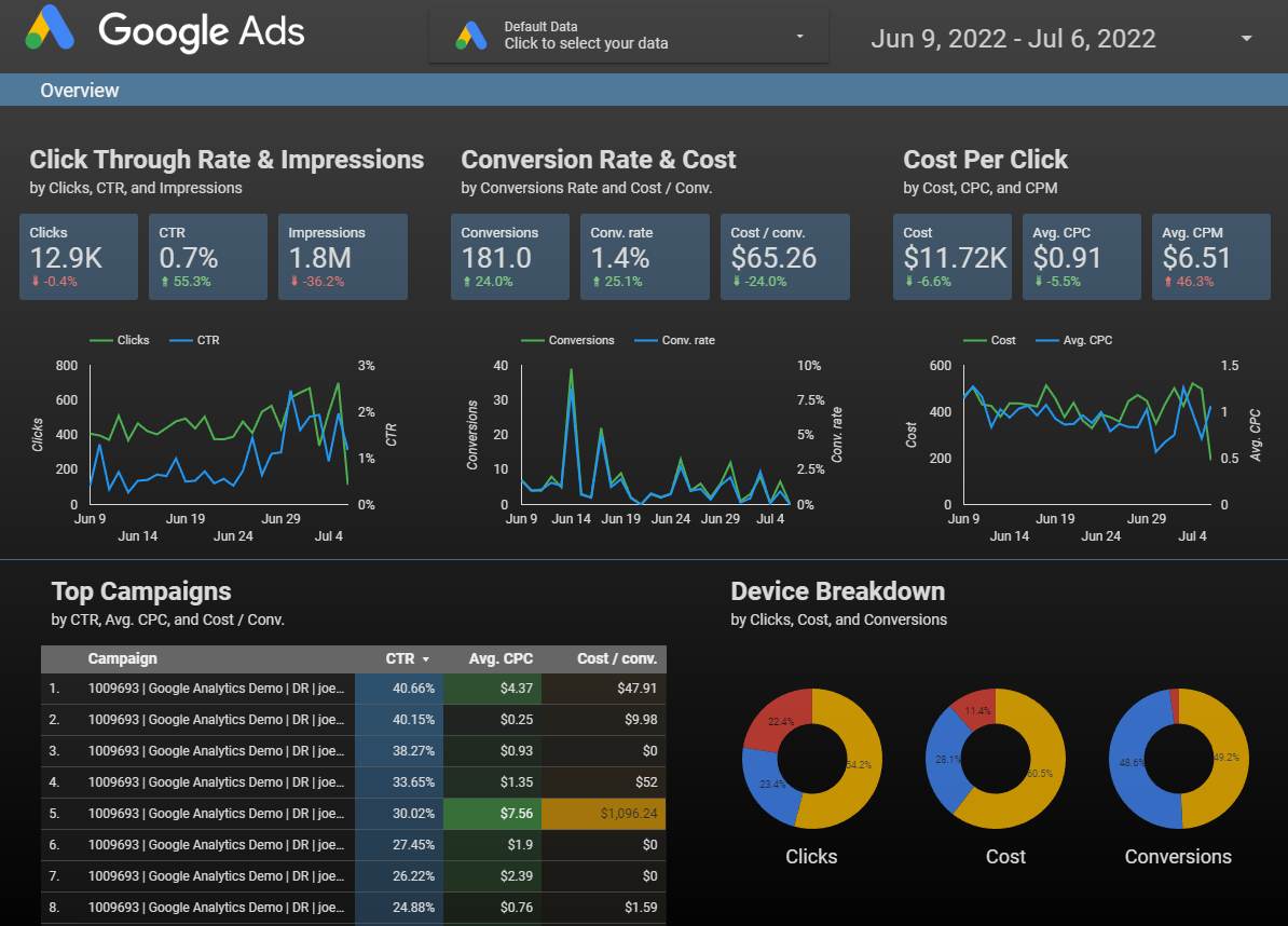
If you’re part of a business enterprise that uses Google Workspace for various business operations, you need to know about Google Data Studio.
This free tool allows you to connect various Google programs like Google Ads and Google Sheets and conveniently turn them into ready-to-use dashboards, making it one of the best data visualization tools for Google users.
Of course, that also means you can blend various data sources and edit the visuals to make them more insightful. Google Data Studio also offers a deep inventory of templates so you don’t have to build from scratch.
Advantages:
- Cloud-based
- Seamless integration with Google products
- User- and beginner-friendly
- Advanced access and sharing mechanism
Disadvantages:
- No auto-refresh method
- Does not support Microsoft Excel
- Live connection needs fine-tuning
- Basic visualizations only
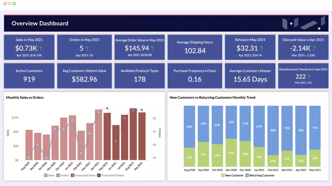
4. Microsoft Excel
Obviously, this list will not be complete if we don’t include the one software program where all of us started.
Microsoft Excel stands tall and proud as one of the earliest tools to create data visualizations. You probably already know that this program allows you to create spreadsheets. If you’re unaware, Microsoft Excel also offers a wide variety of graphs, bar charts, and calculations.
One downside we see to this tool is that even though it’s cheap since it comes with the Microsoft Office 365 package, it’s not free. We believe it’s a bit much, considering how basic the data visualization capabilities are.
It does not include API integration, which you commonly find in data visualization programs. Nonetheless, Microsoft Excel is still a powerful software program that can seamlessly manage big data.
Moreover, it’s extremely popular, so you can probably find countless tutorials on the internet to maximize its potential.
Advantages:
- Smooth processing regardless of data size
- Popular
- No extensive training necessary
- Compatible with other Microsoft products
Disadvantages:
- No API integration
- Very basic visualizations
5. Google Charts
Google Charts is a free cloud-based tool that offers various data visualization features such as histograms, pictographs, and pie charts.
Whether you’re a beginner or an expert in data visualization, you’ll find Google Charts rather useful. That’s because it’s extremely customizable, allowing you to create the simplest to the most complex charts.
Another notable advantage of Google Charts is that it’s completely compatible with virtually all platforms and browsers. However, since it’s cloud-based, the seamless operation diminishes when the data handling gets too large.
Nonetheless, the elaborate customization tools make Google Charts an outstanding tool to use for any type of project.
Advantages:
- Reliable and convenient data integration
- Best choice for users of Google Workspace and other products
- Attractive graphs and charts
- User-friendly
Disadvantages:
- Not enough tool demos or tutorials
- Limited customization capabilities
6. Qlik Sense
Qlik Sense is an AI-powered data visualization tool that gives you a new perspective on managing and exploring your data. It even offers active analytics so you can collaborate with your colleagues in real-time.
This data visualization software program offers three ways of managing your data: private cloud-based, public cloud-based, and on-premises websites. This makes Qlik Sense one of the best tools for controlling your data.
Qlik Sense offers a free trial for the paid version.
Advantages:
- Interactive dashboard
- AI data analytics
- Live connection
- Multiple data management system
Disadvantage:
- High RAM demand
7. Datawrapper
Datawrapper creates interactive data visualizations for your business. That’s right; the charts and graphs are interactive. If you want to use other software applications, Datawrapper is completely embeddable.
You can also import PDF or CSV files into its program, and Datawrapper will automatically convert them.
This tool also allows you to customize the chart’s margins, colors, and fonts. You can even add your own images and numerous other elements to make the chart more comprehensive.
The free version allows you to create and publish data visualizations and export them as PNG. On the other hand, the paid version, priced at $599/mo, provides more extensive customization tools and up to 10 user licenses. Additional licenses cost $21/mo.
Advantages:
- No installation necessary
- Supportive community
- Beginner-friendly
Disadvantages:
- Complex charts are challenging to create
- Security measures need fine-tuning
8. Whatagraph
Don’t mistake the whimsical name for ineptitude. Whatagraph deserves every right to a spot on our list. This all-in-one data visualization tool is a go-to for marketing professionals.
Whatagraph allows you to monitor several channels simultaneously, which means you can link it with data giants such as Google Analytics, HubSpot, Twitter, and even Facebook.
The entire package includes several templates, making it easier for you to build reports. On the other hand, you can also build them from scratch.
All you need to do is to import data from whichever source you’re using, and Whatagraph will allow you to customize it.
The Whatagraph paid subscription starts at $199/month, which allows up to five users and 25 data sources. The $299/mo plan allows up to 10 users and 50 data sources.
Both of these include a 30-minute to one-hour onboarding session to get you started with ease.
Nonetheless, you can also test the tool first with their 7-day free trial.
Advantages:
- User-friendly
- Multiple channel monitoring
- Easy data integration
- Supports more than 40 data sources
Disadvantages:
- Lowest-priced plan is still expensive
- Customer support needs improvement
9. D3

D3, otherwise known as D3.js, allows you to visualize data using a JavaScript library that includes CSS, HTML, and SVG. D3 is one of the best open source visualization tools for editing your graph, pie chart, or map from any device.
Since it incorporates open web technologies, the cross-platform support allows you to access your data from a desktop computer using any type of browser or a smartphone through an application.
However, some features of this tool are quite advanced. It means you might encounter some compatibility issues if you’re using an old browser.
Additionally, you need to learn the D3 API, a collection of modules, for you to be able to use and maximize its toolkit.
It’s an excellent investment of your time since it’s heavily customizable and completely free. Additionally, D3 offers a free course in case you’re having a hard time navigating it.
Advantages:
- Easy to use
- Simple JavaScript technology
- Supportive community
- Lightweight
Disadvantages:
- Compatibility issues with older browsers
- Needs advanced knowledge of D3 API
- Limited visual design
10. Zoho Analytics
Data visualization tools that use the JavaScript library are not for everyone.
Thankfully, Zoho Analytics does not require any advanced knowledge for you to use it. It’s beginner-friendly and is an excellent option for small business owners who want to make informed decisions to propel their businesses forward.
Zoho Analytics allows you to use more than 250 data sources and more than 250 functions to customize and transform your data. Moreover, the dashboard is quite easy to understand.
Everything you need to know is already listed on it.
The interface also uses a drag-and-drop feature, making managing and organizing your data extremely easier. This is one of the main reasons this tool has over two million users around the globe.
This tool also includes an email scheduling feature that allows you to share reports with stakeholders, clients, and even customers. This can significantly improve your business processes, especially if combined with the best email marketing service.
Zoho Analytics offers four paid subscription plans.
The Basic plan is $24/mo which allows two users. The Standard plan, which is at $48/mo, allows up to five users. The Premium plan allows up to 15 users, billed yearly at $115/mo. Lastly, the Enterprise plan targets huge businesses as it allows up to 50 users for $455/mo.
Nonetheless, each plan allows you to add more users for $6.4 per month per user. Of course, the more advanced features are available, the higher your subscription plan is.
That said, Zoho Analytics offers a free version if you only need basic functions.
Advantages:
- Beginner-friendly
- Includes report sharing and email scheduling
- Commendable customer support service
- Can handle big data
Disadvantage:
- Dashboard might be confusing when data gets too big
11. RAWGraphs
If you liked D3 but are having difficulty understanding it, you should check out RAWGraphs. This data visualization software program is built using the D3 platform. It’s the perfect tool to turn spreadsheets into graphs, charts, or maps.
It’s basically the D3 tool for non-programmers. It’s compatible with various basic software programs such as Google Sheets, Microsoft Excel, and TextEdit.
It means all you have to do is to copy and paste the values from these programs into RAWGraphs, and you can immediately start visualizing data.
RAWGraphs is a free and open source program. Nonetheless, they initiated a crowdfunding campaign to keep the service alive. The donations from sponsors and private users are also used to develop the toolkit and include new features.
Advantages:
- User-friendly interface
- Includes scalability option
- Includes mapping feature
Disadvantage:
- Does not include log scales
12. Sisense
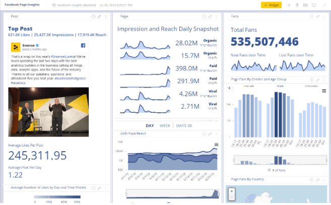
If you want to really get into the heart of your customers and find out what they want and need, Sisense will provide that for you.
This data visualization tool specializes in analytics integration between employees and customers—something you don’t commonly find in visualization programs.
This analytics integration is powered by AI, making it one of the best choices for top companies. Sisense also offers API integration, allowing you to seamlessly process requests and interactions between your devices, applications, and data.
The data visualization solution offered by Sisense is completely customized to your needs.
Instead of asking you for a fixed payment, they calculate the perfect plan for you by asking about your project’s timeline, type, volume of data, and the number of users you wish to include.
It goes without saying that Sisense is a paid program. Their website offers a free trial, but a free version is yet to come, if it will.
Advantages:
- One of the best choices for handling massive data
- Flexible and smooth data visualization techniques
- Superb customer support service
- Continuous upgrades
Disadvantages:
- Requires advanced knowledge when creating analytic cubes
- No time formats
13. Infogram
Gone are the days when charts and maps are boring. With Infogram, you can use 10 maps and more than 35 interactive charts to build your visualization.
Infogram lets you collaborate with your team in real-time since it’s cloud-based.
It’s also compatible with Dropbox, Google Sheets, and Microsoft Excel. You can easily manage your data by importing .csv files from your computer.
Infogram also incorporates a drag-and-drop feature for a more convenient experience in chart management.
The paid subscription starts at $19/mo, which allows you to manage up to 100 projects and use over 100 templates. The highest plan is priced at $149/mo. With this plan, you can build up to 3,000 projects and collaborate with over three users in real-time.
Nonetheless, you can also use their free subscription. However, all your projects will include the Infogram logo.
Advantages:
- Connectivity to live data sources
- Drag-and-drop feature
- Can handle complex data
- Interactive designs
Disadvantages:
- Free plan includes Infogram logo on projects
- Free plan does not include font customization
14. Highcharts
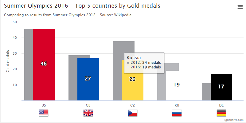
If you’ve already been looking for the best tools for data visualization, you might have encountered Highcharts several times. It’s a rather popular program for small enterprises and big businesses.
You don’t need to learn JavaScript to use this tool. Instead, Highcharts offer multiple plugins to still make your projects heavily customizable.
While the software is intended for developers, it still includes numerous templates to accommodate non-programmers. Although you might have to learn a thing or two to maximize its potential.
The Web solution costs $152/year, while the SaaS and Saas+ solutions are priced at $300/year and $750/year, respectively. Nonetheless, those who don’t plan to use the paid subscription may use the free version of Highcharts.
Advantages:
- Flexible
- Simple interface
- Advanced customization capabilities
- Allows multiple chart layering
Disadvantage:
- Not the best choice for small businesses
15. Microsoft Power BI

If you or your company mainly uses Microsoft Excel to record your data, creating data visualizations becomes immensely easier with Microsoft Power BI.
Since the same company made them, you can expect seamless data integration between the two programs. It’s also equipped with the latest and most advanced data security services, so you don’t have to worry about data breaches.
These services include end-to-end encryption, real-time access monitoring, and sensitivity labeling. Microsoft Power BI is also AI-powered; you can access pre-built data connectors for better integration.
The best part is that you get all of these features for free. However, this does not mean that you also get Microsoft Excel without charge.
Nonetheless, Microsoft Power BI also supports other data sources.
Advantages:
- Easy to explore and understand
- Unmatched security and data protection measures
- Personalized dashboard
- Seamless operation regardless of data size
- Best choice for users of Microsoft Excel and other products
Disadvantage:
- Limited operation when datasets are too diverse
16. Dundas BI
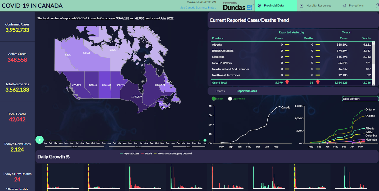
Dundas BI is a paid data visualization tool intended for bigger enterprises.
Aside from data analytics, Dundas BI includes multiple reporting tools and integrated dashboards to make navigating the platform easier and visualize data.
This tool supports various data sources and can even be manipulated in real-time. Their API integration lets you customize your project by embedding it with different applications.
Dundas BI also uses an integrated drag-and-drop tool for convenient chart management.
If you’re interested in this visualization tool but don’t want to pay for it without experiencing it first, you can take it for a test run.
Dundas BI offers a free trial for 25 days upon account creation.
Advantages:
- Flexible
- Supports multiple data sources
- Extensive built-in features
- Drag-and-drop
Disadvantages:
- Not equipped with predictive analytics
- No 3D charts available
17. Fusion Charts
To all the programmers and developers out there, we’d like to introduce you to Fusion Charts.
Despite the name, Fusion Charts actually has a deeper gallery of maps rather than pie charts. Even though this visualization tool is free, it lets you access over 100 chart types and over 2,000 maps.
Fusion Charts supports most of the oldest to the latest browsers out there, even dating as far back as Internet Explorer 6. It means you will hardly encounter any issue with compatibility.
Whether you’re using XML, JSON, or other data formats, the extensive JavaScript charting library of Fusion Charts has got you covered. However, many charts and maps are only available on their paid plan and will not be included in the free plan.
If you want to enjoy these features, you have to avail of their paid subscription, which starts at $499/year and accommodates one user.
The Pro version is priced at $1,299/year and allows up to five users, while the Enterprise plan allows up to 10 users for $2,499/year. However, most of these plans will only allow you to use a single product.
If you want to include more than 10 users and use an unlimited number of products, you need to request a quotation from them through their Enterprise+ subscription plan.
Advantages:
- Active and supportive community
- Superb customer support service
- Customizable subscription plan for massive enterprises
Disadvantages:
- Not beginner-friendly
- Costly
18. Domo
Domo’s data analytics is unmatched. It uses machine learning technology to provide highly accurate predictive insights, allowing you to make better decisions regarding your business’s trajectory.
Moreover, Domo’s data visualization is not just about presenting a report. Its extensive library tells a story with your data as the main focal point.
Aside from the heavily customizable graphs, Domo gives you access to more than 150 charts and over 7,000 customizable maps.
With advanced business intelligence and data visualization features, it’s not surprising that Domo is a paid tool. Its Standard plan is priced at $83 per month per user.
Nonetheless, you can also test it out using the free trial version, which lasts for 30 days.
Advantages:
- Attractive interface
- Provides predictive insights
- Easy cloud integration
- Extensive map library
Disadvantage:
- Complex navigation when switching between datasets
19. Flot
Flot joins the ranks as one of the best free data visualization tools. It uses JavaScript library for jQuery to create dynamic and interactive visualizations.
It supports some of the oldest browsers, such as Firefox 2, Safari 3, and even Internet Explorer 6. You will not encounter compatibility issues as long as your browser is not older than these versions.
With how in-depth the programming of this visualization tool is, Flot lets you resize, pan, and zoom in or out of your charts. Additionally, Flot has a huge supportive community, with some users even creating compatible plugins for the program.
These users also make suggestions and report bugs to the developers just so the program keeps improving.
Advantages:
- Uses JavaScript language
- Interactive charts
- Supports some of the oldest browsers
- Resizing, panning, and zooming capabilities
- Supportive community
- Allows real-time updates
Disadvantages:
- Loading time is slower than other JavaScript visualization tools
- Limited chart options
20. Chartist.js
Responsive and animated charts are almost always paid, but this free data visualization software program likes to change the status quo.
Primarily born out of frustration with various visualization tools milking you for money, Chartist.js offers an extensive gallery of charts without charging you a single centavo.
Chartis.js uses JavaScript library that does not rely on dependencies. As such, you only need a staggeringly small storage space of 10KB to download the program.
Despite this size, this tool will still allow you to create different styles of dashboards and admin user interface. You can create custom dashboards and charts from scratch.
Chartist.js will also help you jumpstart your projects by offering numerous templates. The charts included in the package are also highly customizable.
That’s all thanks to the supportive Chartist.js community that never stops contributing to and upgrading the software program.
Advantages:
- Chart animation
- Extensive gallery
- No dependencies
- Lowest page impact at only 10KB
- Heavily customizable
- Supports plugins
Disadvantages:
- Limited control of tooltip display
- Limited graph types
21. dygraphs

dygraphs is almost the same as Chartist.js in the sense that it’s also one of the best open source data visualization tools that use JavaScript. They also have the zooming, panning, and even mouseover features you’d find in Chartist.js.
You don’t have to worry about interpreting dense and big data because dygraphs can seamlessly manage and process these.
The charts you build using this software program are also customizable. The only difference is that the oldest browser dygraphs can support Internet Explorer 8.
Nonetheless, since you, your customers, and your business are most likely using the latest versions of various browsers, compatibility will not be an issue with this data visualization tool.
dygraphs is also free.
You can explore all its features and functions without spending a single dollar.
Advantages:
- Fairly small learning curve to maximize potential
- Zooming, panning, and mouseover capabilities
- Seamless big data management
- Lightweight
Disadvantages:
- Limited data visualization techniques
- Infrequent software development
- Responsiveness needs fine-tuning
22. Plotly
Plotly is a free open source data visualization tool that allows you to create interactive charts, maps, and graphs. On top of that, Plotly will not even require you to create an account nor have an internet connection just to use the program.
This visualization tool will also allow you to share the link of your visualization project to other websites. All you’ve to do is use the unique URL it automatically creates for you.
The mouseover feature will inform readers how you were able to create your visualization. Thus, Plotly is among the best data visualization tools for writers who have just started their blogs and are looking to improve their online presence.
Despite being free, Plotly has a deep gallery of maps, plots, charts, and maps that will improve your visualization.
Advantages:
- Can work offline
- No registration needed
- Convenient link-sharing
- Diverse visualization options
Disadvantages:
- Requires considerable coding skills
- Initial setup might be confusing if you don’t create an account
23. JupyteR
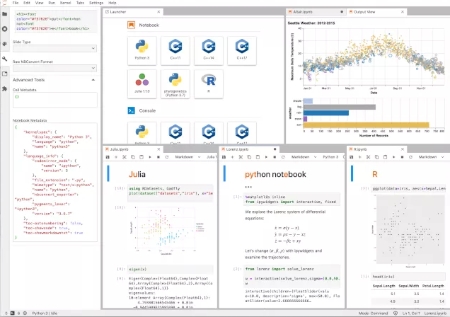
JupyteR is a web-based data visualization platform that allows you to create and share your projects with readers and other users. Moreover, Jupyter allows you to build not just graphs and data charts but also narrative texts, equations, and even live codes.
This makes it one of the best data visualization tools for small businesses looking for a web-hosted service to represent raw data.
JupyteR is also a reliable program when it comes to data cleansing. It can even create numerical simulations and is equipped with machine learning to provide you with predictive insights about your data.
The best part is that you get all of these features for free as this tool is an open source software program.
Advantages:
- Visually appealing designs
- Open source
- Convenient data insight sharing
Disadvantages:
- Collaboration might be a bit difficult
- Reviewing code is complicated
24. IBM Watson
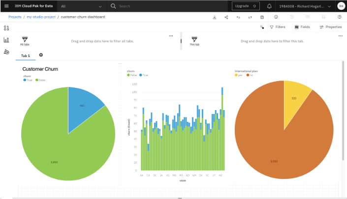
As you may have already known, IBM is a world-renowned tech giant. So, it’s not surprising that they also offer a free data visualization tool.
You just need to create an account and sign up to IBM Cloud to use the service for free as long as you wish.
IBM Watson is equipped with high-caliber data analytics powered by AI. It detects patterns in structured and unstructured data, providing you with actionable insights.
This makes IBM Watson a reliable partner for a data-driven marketing strategy.
The self-service visualization tool also uses NLP or Natural Language Processing, which helps users navigate the insight discovery easily.
Advantages:
- Equipped with NLP capabilities
- Self-service, responsive dashboards
- Can be accessed through multiple devices
- AI-powered analytics
Disadvantages:
- Complex maintenance
- Customer support service is not at par with other visualization tools
25. QlikView

Another product from Qlik, this data visualization tool is a popular option for various businesses and private users in over 100 countries.
QlikView is also equipped with data analytics and allows you to customize your visualizations with numerous tools.
It’s one of the best data visualization tools for entrepreneurs because the interface and software itself are easy to navigate. It means there’s no need for extensive employee training to use this visualization program.
Moreover, QlikView includes Business Intelligence capabilities, allowing numerous enterprises to propel their businesses forward through meaningful insights provided by this tool.
QlikView has a free version for students, small business owners, and other private individuals called QlikView Personal Edition. However, operating QlikView with a license key requires a paid subscription plan.
Advantages:
- Cost-effective
- Visually appealing designs
- Simple and easy to use interface
- Easy to maintain
Disadvantage:
- Like QlikSense, might demand high RAM usage
Having the Best Visualization Tool
A visualization tool is a must if you’re involved in a business that regularly gathers and interprets huge amounts of data. It would provide essential information about the business’s trajectory, allowing you to make informed decisions based on the tool’s insights.
All of the tools we’ve listed above are top-tier. The one you use will most likely depend on what you’re trying to visualize. So, be sure to pick wisely!
FAQs About the Best Tools for Data Visualization
Apart from learning about the best data visualization tools that you can opt for, there are also some pieces of information to keep in mind:
1. What are data visualization tools?
Basically, a data visualization tool is a program that transforms data into a visual representation. It makes it easier to understand the data instead of seeing an overload of texts and numbers.
2. What is JavaScript charting library in data visualization?
JavaScript is a programming language that uses codes to build line charts, graphs, or maps.
Through this, a developer may create basic HTML, SVG, or CSS and then receive the data from an API-integrated program or other sources.
3. What is an open source data visualization tool?
An open source data visualization tool is software created by programmers, which is then uploaded to the Internet, allowing other people to use it for free.
One advantage is that when the communities of the best open source data visualization tools grow, other programmers contribute to their development.
However, the downside is that since it’s free, it sometimes lacks some advanced features that you may only find in paid data visualization tools.
3. Are data visualization tools worth paying for?
If you’re quite knowledgeable with programming, you can maximize some of the best free data visualization tools using JavaScript.
On the other hand, if you’re looking for convenience, ease of use, and unmatched features, then some data visualization tools are worth paying for.
Nonetheless, it’s important that you extensively research a software program before buying it. It ensures that you get the right data visualization tool for your needs.
4. What should you look for in a data visualization tool?
First, you need to look at how extensive the library of charts, maps, and graphs is. You want it to be diverse, so you can always mix things up a bit in your data visualizations.
Second, you want your visualization tool to have the latest features. Interactive charts, responsive dashboards, and continuous updates are important.
Most importantly, you want something that’s very easy to use. Some of the best data visualization tools include a drag-and-drop feature for convenience.
5. What’s the difference between cloud-based and web-based data visualization tool?
As the name suggests, a web-based data visualization tool requires a constant connection to the internet. Otherwise, it will not function properly.
On the other hand, a cloud-based data visualization tool may be used on a local computer. You will still need an internet connection, but only when you’re uploading or downloading data.